

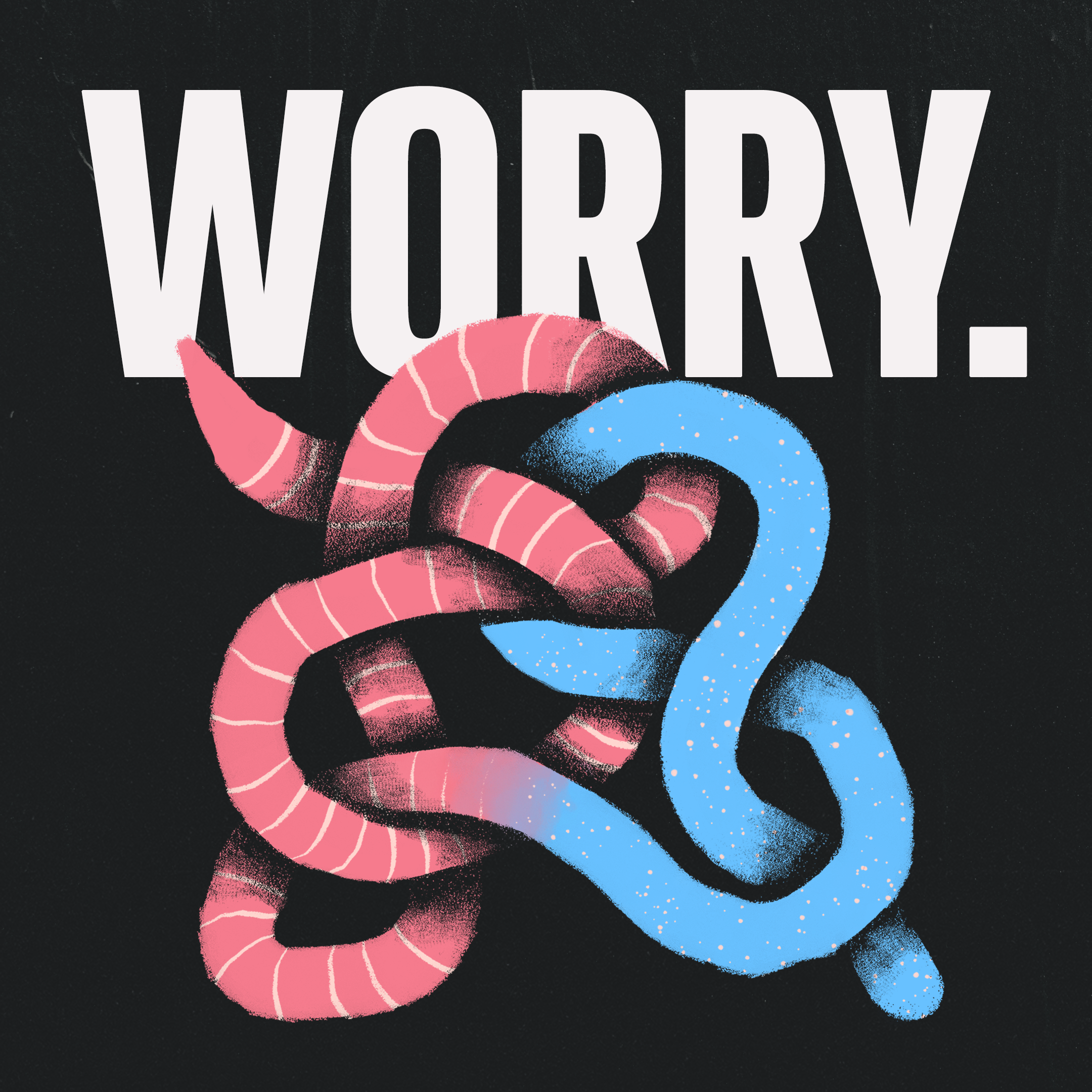
WORRY.
The album “WORRY.” by Jeff Rosenstock was an essential album for me throughout college. What really resonated with me was how this record conveys themes of cynicism and self-doubt in a way that’s explosive and full of energy. But Jeff Rosenstock doesn’t sugarcoat anything either. The lyrics lay these complicated feelings out for all to see. And instead of making you dwell on these emotions, each song invites you to sing along.
As one of my senior projects, I challenged myself to create a new identity for this record that means so much to me. I wanted to represent the difficult sentiments as well as the fun, dynamic sound, and even make reference to the contrast between the two. The parallels between the worm and gummy worm are meant to do exactly that, while also blending these two concepts into one. The earthworms symbolize the squeamish feeling that comes with anxiety while the sour gummy worms represent the overall sound of the record.

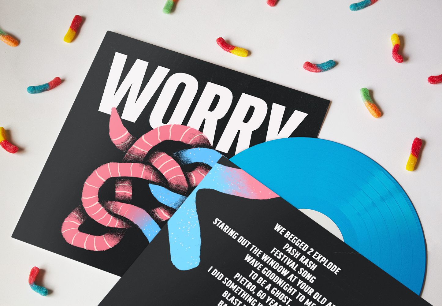
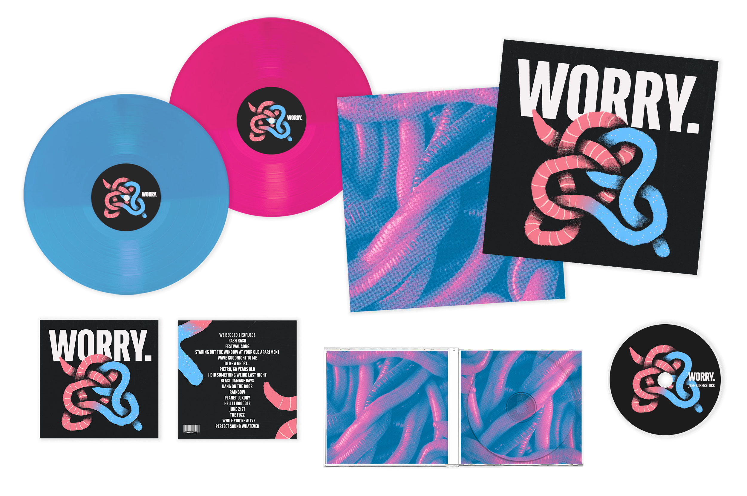


Merchandise + Promo
While expanding this system, I was inspired by the recognizable color combinations found in sour gummy worms. The album packaging mainly uses the colors of blue and pink gummy worm, but I wanted to incorporate the red + yellow and orange + green pairings elsewhere in the system. All while the earthworms create an interesting juxtaposition that draws people’s eye.
The vibrancy of the colors also makes for appealing merchandise + promotional materials that stand out in Instagram feeds and on the street.


